Microsoft 365 editors include an Accessibility Assistant. This tool searches your document for content that may not comply with accessibility standards and offers remediation suggestions.
Locating Accessibility Tools
The Accessibility Checker can be found under Review>Check Accessibility. Clicking the icon will open a pane on the right-hand hand side with issues and suggestions.

Additional options for the checker include:
- Running the Accessibility Assistant
- Applying alt text to an object
- Entering or exiting Focus mode
- Viewing the application's accessibility settings.
Common Accessibility Issues
When running the Accessibility Assistant, it will search your document for the following common issues:

Color and Contrast
The contrast between the color of text and its background affects the legibility of the document, especially for readers with color blindness or other visual impairments.
The Web Content Accessibility Guidelines require a contrast ratio of at least 4.5:1 for text to be legible. Contrast ratios range from 1:1 to 21:1, where 1:1 is the same color and 21:1 is black and white.
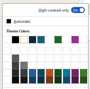
The Accessibility Assistant will recommend similar colors that have an appropriate contrast ratio. It can also be used to launch a color picker that shows only options with a high contrast ratio. Alternatively, the page’s background color can be changed from this menu.


Media and Illustrations (Alt Text)
Alternative (or alt) text provides a written description of an image or object in a document so that users who rely on screen readers or have visual impairments can understand its content.
All images in a document should have alt text that briefly describes their purpose and contents.
In the Office suite, alt text can be added by right clicking an image and selecting View Alt Text. A sidebar on the right contains suggestions for alt text and a text box. If alt text is automatically generated, this sidebar is used to review, edit, and approve the description.

Alternatively, if the image is decorative and serves no informational purpose, it can be marked as such in the Alt Text sidebar.
Document Structure (Headings)
Headings help users and screen readers to navigate a document. In word, headings and other identifying formats can be applied as Styles.

Headings can be applied in Word from the Home menu. The following common headings are recommended:
- Title indicates the title of the content and should be used once per document.
- Heading 1 indicates broad topics within the content, like chapters.
- Heading 2, Heading 3, and beyond indicate smaller sections within the content.
Document Structure (Reading Order)
Reading order determines the sequence in which content is read aloud by screen readers. If the reading order does not match the intended flow of information, users who rely on assistive technologies may receive content in a confusing or illogical way, making the document difficult to understand and navigate.
In Microsoft Word, reading order is determined through Headings as described above. In other Office apps, the reading order may need to be defined.
In PowerPoint, reading order can be defined via the Selection Pane. To access this pane, navigate to the Home ribbon, click Arrange, then Selection Pane. A sidebar on the right will list all elements that are present on the slide.

To change an item’s position in the reading order list, click and drag it or select it and use the up and down arrows. This pane can also be used to hide or lock objects on the slide.

Tables
Users of screen readers can run into issues with tables that are not clearly formatted. Wherever possible, tables should include clear headers and avoid merged cells.
When editing a table, the first row can be marked as a head row using a checkbox in the Table Design ribbon. Using Banded Rows can also aid visibility.

Links
Hyperlinks should be long enough to easily click and clear enough to effectively communicate their destination. Common issues with hyperlinks include:
- Being too short.
- Single word hyperlinks, such as “Click to access,” are easy for all readers to miss and difficult for users with limited dexterity to click.
- Not being descriptive.
- Screen readers will present links to users as they show in the text. Concise descriptions, like “our IT Solutions Article regarding MFA,” make it clear where the link leads.
- Not containing descriptive text.
- Hyperlinks should contain their own description. See the example below.
- Zoom link: https://kutztown.zoom.us...
- In this example, screen readers may not give users context for the link they are expected to click.
Document Access
If a document is restricted or protected, users who rely on assistive technologies may not be able to interact with or read the content as intended.
The Accessibility Assistant will check for restricted access to the document and recommend changes where appropriate.
